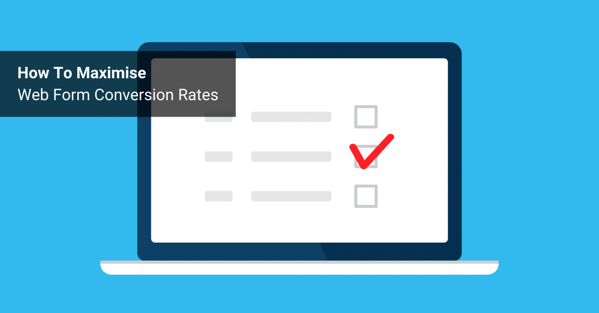
If your website is already getting a steady stream of traffic, then conversion-rate optimisation is the single quickest way to get more leads online.
There are plenty of ways to go about this, but you want results as quickly as possible right?
So I suggest an 80/20 approach. Start with the little tweaks that will get the biggest results.
In my experience, this means starting with your web forms.
NOTE: Before we dive into the specific tips, let me just say this… If you do NOT already have a web form with a specific call to action on every page of your website, you are missing out on an enormous percentage of online leads.
The good news is, that you can easily reap the benefits of improving this straight away. So go ahead, add a specific and relevant web form or opt-in form to all your webpages. These should ideally be placed above the fold in the right-hand sidebar for maximum exposure.
Like all conversion-rate optimisation activities, the Devil’s in the detail. Make sure you address each of the nine points below and you’ll be well on your way to a stronger conversion rate…
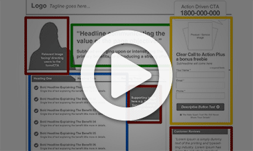
1) Descriptive Form Headline
Give the form a clear and specific purpose. A ‘Free Consultation’ or ‘Request A Quote’ form is much more powerful than a generic contact form.
The more specific your form, the more efficient it can be in progressing your prosp
ects down your sales funnel. Conversely, a generic form will result in ambiguous enquiries that cost you time and sales.
2) Thumbnail Graphic
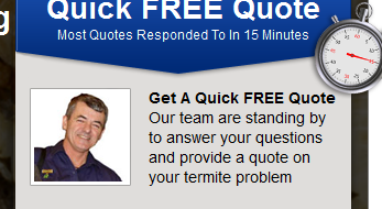
Adding a graphic to a webform is a great way to draw immediate attention to (arguably) the most important element on your page. I am yet to see a split-test where including a relevant thumbnail on a web form has not performed better than a form with no image.
Keep it relevant and you can’t go far wrong (think report thumb
nails, phone images, PDF icons, a photo of a key person, etc).
3) Added Bonus

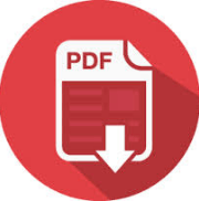
People in the Internet Age crave instant gratification. Adding a bonus that can be instantly delivered is a powerful way to boost your lead volume. This is especially true of offline offers like posting a hard-copy report that could take days to fulfill.
PDF checklists and cheat sheets are a great way to help your prospects now while the offline component is still pending delivery.
4) Left-Aligned Labels, Big Fields
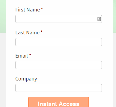
Filling out your form should be easy! So use large (even oversized) textboxes and field labels.
In any competitive industry, your prospects will be looking for any excuse to close
your website and go to the next competitor in line – don’t make a frustrating form layout another reason for them to click away.
5) Only Request The Bare Minimum

Your opt-in shouldn’t feel like an interrogation… Make sure your mandatory fields are commensurate with what you’re giving away. Asking for anything more than name and email address for a free report (or similar) is like asking someone to marry you on the first date.
Remember, lead generation marketing is about a number of incremental conversations. Have faith in your marketing funnel and your sales team to capture more details when the opportunity arises.
6) K.I.S.S. Button Text
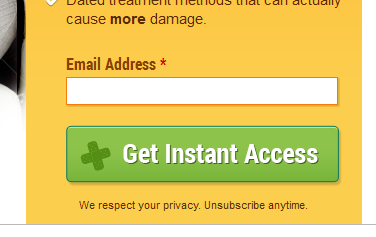
Button text is a crucial but often overlooked aspect of form optimisation. “Submit” isn’t going to cut it these days.
Remember Keep It Simple, Stupid (K.I.S.S.). Your button should be short and descriptive – you want to remind your prospect what’s in it for them. In my experience, if you try to get too clever with your button text, you’ll hurt your conversion-rate.
“Request Consultation”, “Free Online Quote”, “Get Instant Access”, “Watch Video” and “Do
wnload PDF” are all great examples of good button text which reinforces why your prospects should act now.
7) Large, High Contrast Button

Your call to action button is one of the single most important elements on your page. The best way to make this stand out is to use a large, high contrast button that is enticing to click. There has also been debate over the best colour to use. Orange or green are usually a safe bet.
8) No Front-End SPAM Fields

Front-end SPAM protection tools like CAPTCHA are great for preventing junk submissions, however they will also reduce your conversion-rate for genuine prospects. These are becoming increasingly frustrating to decipher which can result in page abandonment.
Nowadays, there are many free tools that take the onus off your prospects and instead use smart, hidden technology to identify ‘bots’.
9) Privacy Text

Junk emails are more prevalent than ever before. It’s important to reassure your prospects when trusting you with their information.
Adding a line of privacy text serves as a small yet important reminder of this.
Some tests suggest that this should be used in a positive light (e.g. “We unconditionally respect your privacy”) rather than negative (e.g. “We will never SPAM you. Unsubscribe at any time.”). However, these results were not replicated across different industries, so my suggestion is to test both and find out what works best for you.
Try Web Form Optimisation For Yourself With Our FREE CHEAT SHEET
There you have it; the anatomy of an effective lead generation web form. Paying attention to each of these simple, yet important points will put you in a strong position to make the most of the traffic arriving on your website.
Form optimisation isn’t exactly rocket science, all you need to is this:
- Get your prospect’s attention…
- Give them a compelling reason to act now…
- Make it easy for them to do so…
“WEB FORM CHEAT SHEET”
To help you get these changes in place on your own site, we’ve put together a handy PDF Cheat Sheet.
You can download your copy by CLICKING HERE (no opt-in required).
Please let me know how this works for you in the comments below!