You already know first impressions are important. And there’s nowhere more important than the “above the fold” area on your homepage.
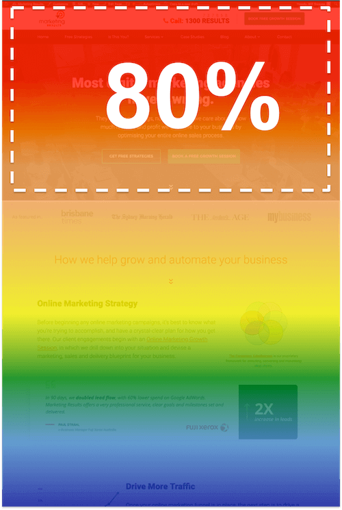
Above the fold is the area that is most likely to get read. Also, the most likely to grab the user’s attention. In fact, an eye-tracking study by Jakob Nielsen suggested that up to 80% of visitor time is spent above the fold.
That’s why simply optimising your User Experience (UX) above the fold can be so impactful.
In this article we’ll look at some above the fold website examples from some recent projects, plus share the underlying principles you can use to optimise this super-valuable real estate on your own site.
Try This Quick Above The Fold Audit
Open up your homepage – no scrolling. Now put yourself in the shoes of your ideal client, and ask these 3 questions:
- Where am I? (What sort of business / website is this?)
- What can I do here? (How can I get value?)
- Why should I do it? (Why should I act?)
If you struggle to come up with compelling answers to any of these questions, chances are you’re leaking customers… and sitting on a golden opportunity.
Let’s dig down further with a few concrete examples…
5 “Above The Fold” Website Examples (And Why They Work)
I’ve applied the same three-question exercise to five recent Marketing Results clients so you can see how this applies to various real-world businesses…
Example #1: Territory Homes
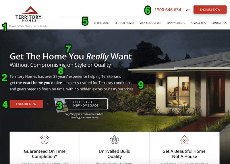
Where am I?
1. The tagline below the logo makes it very clear what Territory Homes do and who they serve (i.e. home builders in Darwin).
2. The explainer text below the headline elaborates on their expertise and target audience (i.e. “helping Territorians get the exact home you desire – expertly crafted for Territory conditions”).
What can I do here?
3. Visitors can learn more about building a new home via free resources.
4. Or they can “enquire now” to speak to an expert and start the home building process.
5. There’s a simple, declarative menu – it’s clear what each item would lead.
6. There’s also a phone number where visitors can contact them directly.
Why should I do it?
7. You’ll “Get the home you really want without compromising…”, which implies that other solutions require you to choose between style, quality or cost.
8. They boast 31 years’ experience – this isn’t their first rodeo.
9. They provide three key Differentiated Benefits:
9.1. Specialists in building homes for “Territory conditions”, which suggests most homes are not built for the extreme weather of the region.
9.2. An “On Time Completion” guarantee to overcome the common concern that the build will run over-schedule and lead to additional costs.
9.3. “No hidden extras or nasty surprises”, to put first-time home builders at ease.
Example #2: My Celebrant
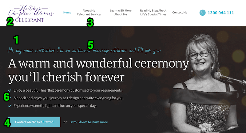
Where am I?
1. The pre-header and headline make this extremely clear. My Celebrant is “an authorised marriage celebrant” offering “warm and wonderful ceremonies”.
2. The logo (with “CELEBRANT” in clear type) and the navigation (with “About My Celebrant Services”) are persistent elements that reinforce the key offering.
What can I do here?
3. You can learn more about celebrant services – particularly about what makes Heather different…
4. Or you can get in touch with Heather to “get started” planning your own ceremony.
Why should I do it?
5. She’s an authorised marriage celebrant, so her qualification is recognised.
6. The key benefits are:
6.1. The ability to customise your ceremony.
6.2. The done-for-you aspect of the relationship (i.e. “I design and write everything for you”).
6.3. Visitors might not have even considered how “warmth, light and fun” can fit into their ceremony.
Example #3: Tuff Turf
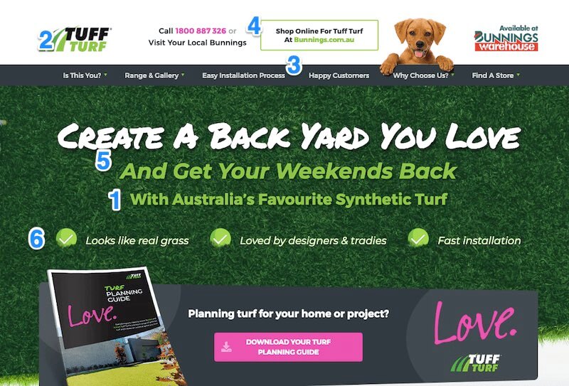
Where am I?
1. The subhead positions Tuff Turf as “Australia’s Favourite Synthetic Turf” company.
2. This is reinforced by the “Tuff Turf” brand name itself, containing an implied benefit (i.e. it’s more hardy than conventional turf).
What can I do here?
3. This site is primarily focused on buyer education (with the Planning Guide, Gallery, Installation process, etc.).
4. The major “commercial” call to action is to direct consumers to their closest Bunnings Warehouse to purchase. The goal here is thus to pre-educate the prospect to select Tuff Turf at the point of purchase.
Why should I do it?
5. The ultimate benefit is front and centre: “Get Your Weekends Back”. While cost and quality are important considerations, ultimately it’s the low-maintenance lifestyle that the product delivers that is most appealing to many buyers.
6. They make good use of Differentiated Benefits below the header:
6.1. “Looks like real grass” – most artificial turf does not.
6.2. “Loved by designers and tradies” – if experts love it, you will too.
6.3. “Fast installation” – which is not the case for all solutions.
Example #4: Designer Sheds
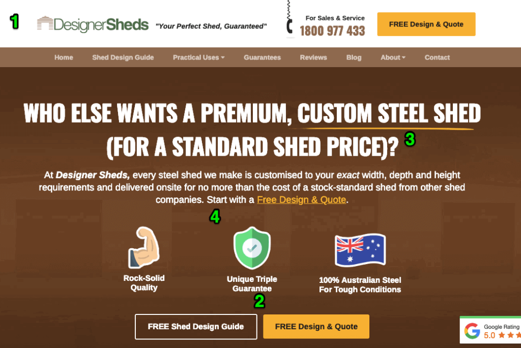
Where am I?
1. Almost every element here reinforces the fact that this is a custom shed manufacturer that offers a free custom shed design service.
1.1. The brand name: Designer Sheds
1.2. The tagline: “Your perfect shed, guaranteed”
1.3. The headline: “Who else wants a premium, custom steel shed…”
1.4. The subhead: “…every steel shed we make is customised…”
1.5. The offers: “Free Shed Design Guide” and “Free Design and Quote”
What can I do here?
1. They make a big, bold promise that you can “get a shed customised to your exact width, depth and height requirements, delivered onsite for no more than the cost of a stock-standard shed…”.
2. There are two ways to move forward:
2.1. Request a Free Shed Design & Quote.
2.2. Download the Free Shed Design Guide.
Why should I do it?
3. The Big Idea here is that you can get a premium, custom steel shed, for a standard shed price – more value for less money.
4. They provide three Differentiated Benefits:
4.1 “Rock-solid quality” – to pre-empt the objection that the quality must be lower if the price is so competitive.
4.2. “Unique triple guarantee” – they don’t elaborate on this above the fold. Just enough to intrigue the customer.
4.3. “100% Australian Steel” – to once again dismiss objections about quality and too-good-to-be-true concerns.
Example #5: JetConvert
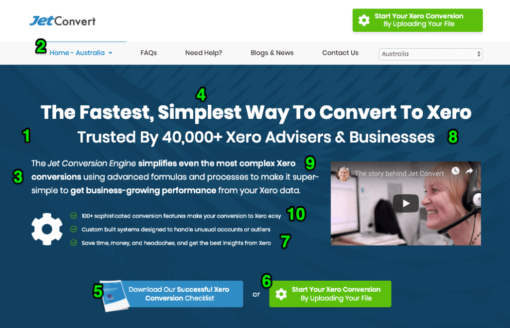
Where am I?
1. The headline, explainer text, bullets and call to action elements all emphasise JetConvert’s Xero conversion services.
2. Australian visitors can be confident they’re in the right place because they have featured the country name in the primary navigation.
3. They assume the visitor knows what Xero is, has identified the need to transition to Xero and knows that it is typically not a simple process.
What can I do here?
4. They can get assistance transitioning their data from another accounting platform to Xero.
5. They can learn more about the conversion process via free resources (especially the Free Checklist).
6. They can begin the conversion process by uploading their file.
Why should I do it?
7. Speed and Simplicity: Because it’s “the fastest and simplest way” to do it.
8. Peace of mind: Their solution is trusted by 40,000+ industry professionals, which serves as compelling social proof.
9. Unique mechanism: “advanced formulas and processes” to dramatically simplify and accelerate an otherwise complicated and time-consuming process.
10. Reassurance for even difficult or edge cases: e.g. “100+ sophisticated conversion features” and “Custom built systems to handle unusual accounts and outliers”.
Over To You
Optimising your “above the fold” section often provides valuable quick wins. Doing this is usually one of the first steps in our Growth Advisory program, because it tends to yield some of the quickest wins.
If you want more ideas and a proven framework to strategise, plan or execute client-getting campaigns that explode revenue and profit, another great resource is our Free Digital Growth Strategy Map.
