What are the best Facebook ad examples around today, and how can you use them as inspiration for your own Facebook advertising campaigns?
On the surface, Facebook advertising sounds pretty simple. But if you make some wrong decisions around audience targeting, ad design or placement – all of a sudden you’ve blown your whole budget and don’t have any leads for your troubles.
So we decided to put together an epic list of the best Facebook ads to give you some guidance.
These ads are from companies and brands with a range of ad budgets, and lots of advertising experience.
They’ve done the hard work – and spent the money – on testing ad formulas, design elements and formats to run Facebook ads that deliver results.
We started by analysing hundreds and hundreds of successful Facebook ads before cutting the list down to 38 winners.
We’ve also learnt a whole lot about what makes a good Facebook ad along the way. As it turns out, there are a set of elements that continue to turn up time and time again.
What Are The Common Elements In The Best Facebook Ads?
The best Facebook ads tend to include these elements – some are non-negotiables.
- Stunning images (non-negotiable)
- Focused value proposition (non-negotiable)
- Specific audience targeting (non-negotiable)
- Brand congruency (non-negotiable)
- Goal-oriented objectives (non-negotiable)
- Compelling call-to-action or offer
- Potential benefits/results for the prospect
- Multiple versions and split testing
- “Realistic” looking visuals, as opposed to stock images
- Using faces in the images
- Adequate background space and simplicity with images
- Incorporating social proof
- Leveraging video ads
- Image scrolling and carousel ads
- Humour, emotion or curiosity
- Previewing the product/service offering
Now let’s look at some of the best Facebook ad examples and see how they measure up to this list.
1. Airbnb
Airbnb is an online marketplace where people can list, find, and rent residential housing in over 190 countries worldwide.
The below video ad came from a strategic partnership with Disney’s Jungle Book movie.
It’s compelling because it engages the audience with a professionally developed video, and elicits excitement and emotion by tapping into childhood dreams and the adventure tendencies of their target audience.
The ad also gives a real-life preview of the unique properties available to Airbnb users. (This is their value proposition)
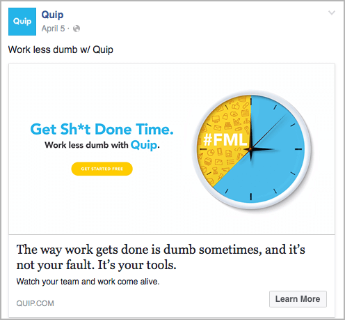
2. Quip
Quip is a software product that helps you create, discuss and organise all the important documents your team is working on.
The below ad does a great job of sparking curiosity in the viewer with provocative language and some edgy connotations.
Using simple, brand congruent colours in the image, paired with a clear call-to-action make this ad easy to understand and visually appealing.
Is the language too provocative for your liking? Or have they just nailed their target persona?
3. Adonit
Adonit make a touch screen stylus pen for tablets and smart phones.
In this video ad they have effectively used a “product preview” strategy to spark curiosity with their prospects.
It’s more of an education and brand awareness campaign, but it does the job very well.
Do they target too broadly with the “Everyone” suggestion at the end of the video? Perhaps.
4. Skillshare
Skillshare is an online learning community with thousands of bite-sized creative skills classes.
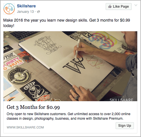
In their Facebook advertising campaigns they use real photographs of designers at work, placing their target audience in the shoes of a buyer.
Below is an example which also includes a very specific call-to-action and price benefit for the prospect.
5. Lyft
Lyft is a ride-share app with millions users worldwide.
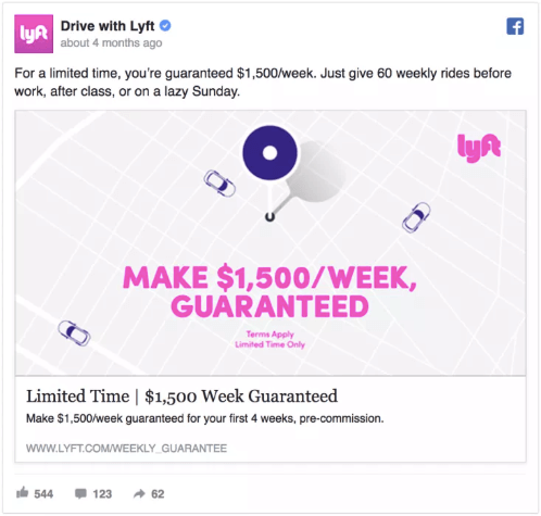
Their two-sided business model means they need to attract customers and drivers. This ad targets the latter.
High-contrast pink text stands out from an otherwise minimalist graphic. This captures the user’s attention and focuses them on the offer.
The real magic here is the offer itself. So simple, yet so powerful. If you do this modest task (i.e. give 60 rides) we guarantee you’ll get this attractive benefit (i.e. you’ll make $1,500 per week).
The “Limited Time Only” copy snippet is used to build urgency and encourage immediate action.
6. Consolidated Investment Group (CIGA)
Consolidated Investment Group Australia (CIGA) is an integrated property and finance advisory firm .
This ad is designed to generate leads for the CIGA’s “First Home Buyer Assist” program.
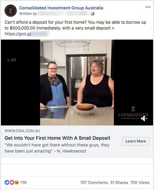
The opening sentence “Can’t afford a deposit for your first home?” captures the attention of the client’s target prospect type, by articulating a key problem.
The promise, “You may be able to borrow up to $500,000.00 immediately” and headline, “Get Into Your First Home With A Small Deposit” provides an intriguing reason for the user to click and learn more about the service. Who wouldn’t want to know how this works?
This is a video testimonial ad, showcasing two clients in their brand new home. Leveraging a video like this allows CIGA to “show, not tell”.
This ad has 116 likes/loves/laughs, 107 comments, 31 organic shares, and 70,000 views on Facebook, all of which contribute to the authority of the ad’s message.
7. Cadillac
It’s really the simplicity of this ad from Cadillac that makes it so good…
Everyone who sees this ad most likely already knows who Cadillac is and what they are getting themselves into, so the purpose of this ad is simply to reinvigorate buying behaviour, and create excitement.
The use of sleek colours, a message-consistent back drop and a TV quality video are all aligned to Cadillac’s target audience who are seeking status and recognition.
8. Modcloth
Modcloth has a growing reputation for their social media marketing, especially when it comes to Facebook ads.
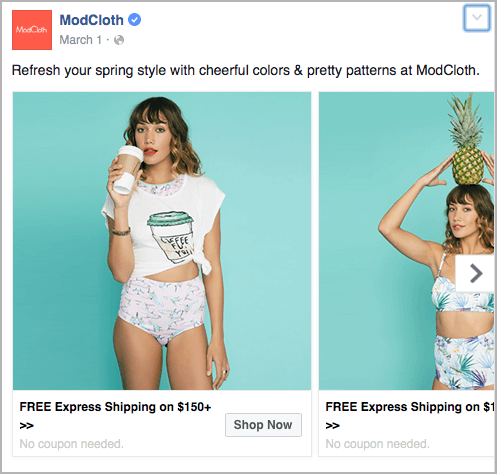
In this example they have used the Facebook carousel ad option to include multiple images – this is a high-performing strategy for ecommerce businesses, especially in fashion.
Visually these ads are eye-catching, with simple backgrounds and curiosity sparking elements such as the pineapple.
They also provide a preview of the goods, plus create a human connection with real-photos and faces.
If you run an ecommerce business, I’d recommend following Modcloth and learning from their Facebook ads strategy.
9. BarkBox
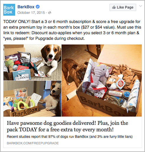
BarkBox offers a subscription service for dog goodies.
The best thing about their Facebook ads is the use of dog photos and product previews. It really puts the prospects (the dog owners) in the shoes of a buyer, and helps them see what it would be like to be a customer.
Whilst the visuals in this example are compelling, they could simplify the supporting text by eliminating some of the details and getting super-focused on one specific action they want a prospect to take.
10. HelloFresh
Ads aren’t just for acquiring new customers.
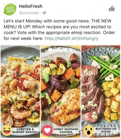
Foodbox subscription service, HelloFresh, use Facebook ads to maximise the lifetime value of existing customers.
This is a clever combination of design, copy and Facebook’s “emoji reaction” functionality to let users “vote” for their favourite meal.
The benefits are twofold:
- Customers are emotionally engaging with the product before it’s even delivered. This is likely to boost brand loyalty, increase customer lifetime value and reduce attrition.
- Since Facebook’s algorithm rewards engagement, it is likely to increase their organic reach, reduce their cost per impression and improve the overall effectiveness of the campaign.
Who said Facebook ads can’t be fun AND effective? ?
11. Billetto
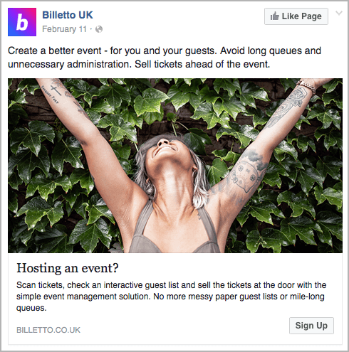
Billetto is a UK business that helps people discover, promote and run events.
The genius of their Facebook ad below is how well it shines the light on their ideal customer, and captures the emotion associated with the end result of their service.
Again though, the supporting copy is a little confusing – they are trying to include too much information and not enough action-oriented information.
12. McGregor Wealth Management
McGregor Wealth Management offers personalised financial planning for six-figure earners who want to continue (or exceed) their current lifestyle in retirement.
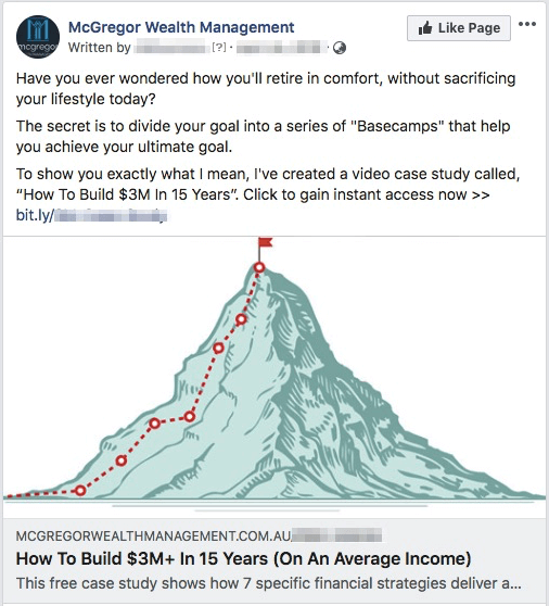
This ad begins with a hypothetical question, calling out to the ideal prospect’s problem (i.e. “Have you ever wondered how you’ll retire in comfort, without sacrificing your lifestyle today?”).
Then the transition phrase is introduced: “The secret is to divide your goal into a series of “Basecamps” that help you achieve your ultimate goal”.
The call to action is opting into a video case study called “How To Build $3M In 15 Years” demonstrates how the reader can learn more and solve their problem.
This ad has 44 likes/loves/laughs, 9 comments, and 26 organic shares, all of which contribute to the authority of the ad’s message.
All of the above is coupled with ‘mountain climbing’ imagery to reinforce the “basecamp” analogy.
13. CoPromote
CoPromote is a network of “creators”. People who produce content online. It helps these content creators expand the reach of their work by promoting them across social networks such as Tumblr, Vine and Twitter.
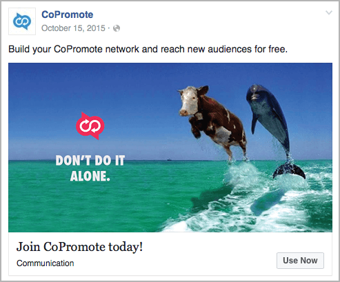
They do a lot right in the below Facebook ad by using an eye-catching visual that sparks curiosity and humour. It also aligns to their brand and core messaging with the use of their logo and supporting text.
14. Farmdrop
Farmdrop offers a direct connection to local produce with a service that delivers straight from the farm to a household.
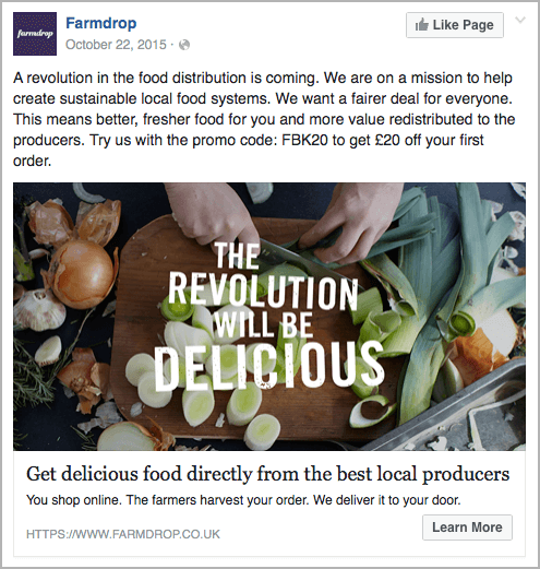
This ad is really a brand awareness push because the call-to-action isn’t as specific as it could be. But they do effectively use overlay text and a high-definition image to make the ad standout in the Facebook content stream. They have also done a great job of using the headline text below the image to deliver a very specific message that tells you a LOT about what the business does.
15. Autopilot
Autopilot is a multi-channel marketing platform used by global companies like Atlassian, Microsoft, Patron and Samsung.
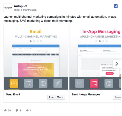
They use Facebook’s carousel ad format to showcase the product’s features (e.g. email, in-app messaging, SMS and direct mail).
The ad does an excellent job of using visual cues:
- Each feature has its own corresponding colour (e.g. email = yellow, in-app messaging = pink, etc.).
- There are four circles below each header. The shaded circle represents the position of each slide in the set.
- There are four icons at the bottom of each slide. The highlighted icon represents the position of each slide in the set.
This indicates that some information is hidden. These cues encourage users to engage with the ad and find the most relevant information.
16. Nespresso
Nespresso has revolutionised the coffee industry, and it’s largely due to their smart branding and marketing efforts.
This video ad is simple yet extremely effective. It uses a basic set of colours, lots of background space and shows off their range of products.
17. Plated
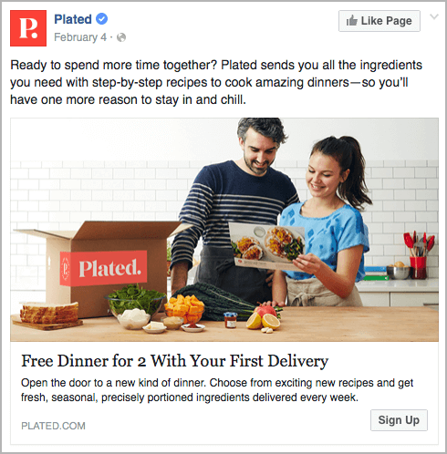
Plated is part of the “subscription box” trend taking the world by storm… Pick your recipes, get a weekly box and cook amazing meals; is their value proposition. It’s simple and enticing for the busy family or career-focused couple.
In this Facebook ad they have packed in lots of goodness when it comes to our list of common elements above. The visual has brand congruency; a preview of the goods; faces; and specific audience targeting. They’ve backed it up with some well thought out text and a clear call to action.
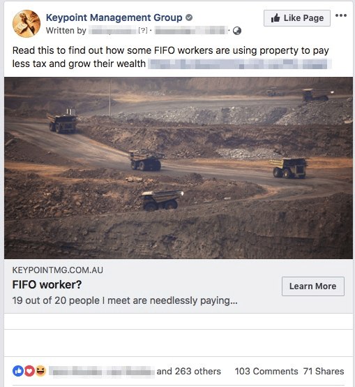
18. Keypoint Management Group
Keypoint Management Group helps everyday Australians pay less tax and create the lifestyle they desire.
This ad is designed to generate leads for their Fly-In-Fly-Out wealth creation service.
The text “Read this to find out how some FIFO workers are using property to pay less tax and grow their wealth” lets Keypoint demonstrate their expertise and solve a problem, for an already-skeptical audience.
Mining equipment was chosen as it is familiar to this audience, and may not be seen frequently on Facebook. This creates a noticeable pattern-interrupt in users’ news feeds.
The text “19 out of 20 people I meet are needlessly paying…” is truncated to create a sense of intrigue. This will increase the ad’s click through rate, and therefore its Relevance Score (hence boosting the ad’s overall effectiveness).
Social proof is used to boost authority. This ad has 265 likes/loves/laughs, 103 comments, and 71 organic shares, which collectively build trust.
19. Flok
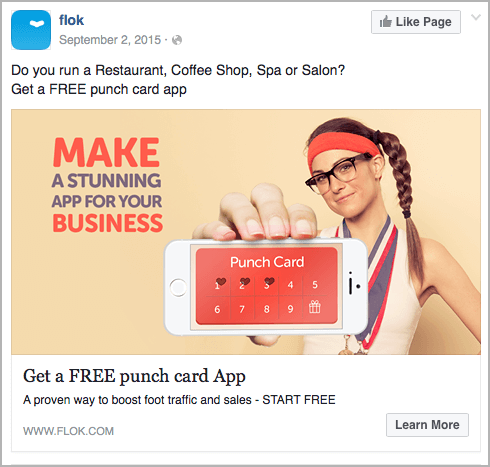
Flok is a loyalty based app for small businesses – it’s like a punch card gone mobile.
In this ad they’ve immediately made it clear who their ideal target audience is: restaurant owners, coffee shops, spas and salons. If you run one of these businesses, all of a sudden you’re taking notice.
There is also some great consistency in the call-to-action, making it much easier for people to make a quick decision. And the image utilises consistent colours, background space and a human face for personalisation.
20. Zenreach
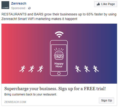
Zenreach is a WiFi-powered marketing platform for retailers.
Even though they help all manner of retail businesses, this ad specifically calls out to restaurants and bars.
If you owned a bar, which solution would you choose:
- One with generalist retail experience?
- Or one that specifically understands the challenges of the hospitality industry and a 65% upside for restaurants and bars?
Option #2, obviously.
In less than 35 words, this ad covers our entire value proposition formula.
- Prospect: “RESTAURANTS and BARS”
- (Implied) Problem: “Bringing customers back to your restaurant.”
- Promise: “Supercharge your business with Smart WiFi.”
- Proof: “…grow up to 65% faster”
- Proposition: “Sign up for a FREE trial!”
The graphic also does a good job of visually conveying how they help.
21. Free Restaurant Recipes
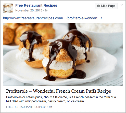
Free Restaurant Recipes is exactly what it sounds like… A website that provides heaps of recipes for free.
The reason I chose to include this ad is because the image does all the work. It’s high-quality, shows off the end result of the service and taps into the indulgent emotions of our brains.
Unfortunately, they haven’t used the space for text as well as they could have by delivering a clear call-to-action and consistent message.
22. Freeletics
Freeletics offers an app-based training program for people looking to get into shape.
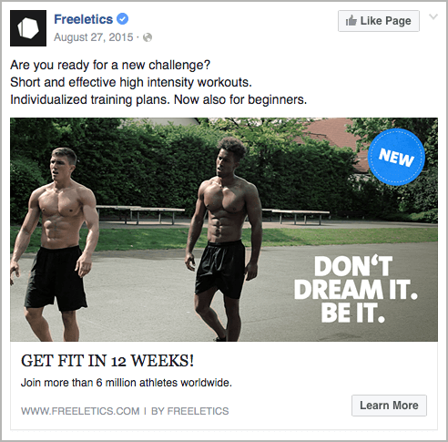
In this ad they have used some compelling visual elements and social proof to entice clickthroughs.
The “New” badge taps into our love for new things, and the real-life photos of fit looking males shows potential users what they could look like if they get the app. It’s showing off the end result.
As a bit of icing on the cake the strategic placement of “Join more than 6 million athletes” is a great piece of social proof.
23. Freshly
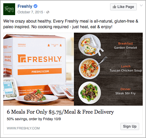
Ok… so this is another box subscription called Freshly. The difference between this one and FarmDrop is that the meals are chef-prepared and ready to go when they arrive at your house, rather than just getting the ingredients and recipe.
I love how clear and to the point this Facebook ad is. There’s no guessing about who their target audience is or what type of service you will get by clicking on the offer. Plus they’ve stepped it up with some stunning visuals, a product preview and branding.
24. Fundera
Fundera is a US company that lets business owners search and compare loan rates.
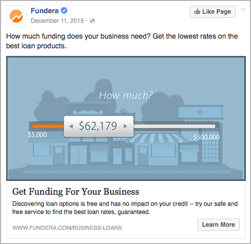
This ad smartly uses a sliding scale graphic to let prospects know how much funding they could be getting from this site, and it’s supported with some well positioned supporting text and a clear call to action.
They’ve also used high-converting power words such as “lowest”, “safe”, “best” and “free” to entice users to click through.
25. Inspiralized
Inspiralized is a kitchen tool that turns vegetables and fruits into noodles.
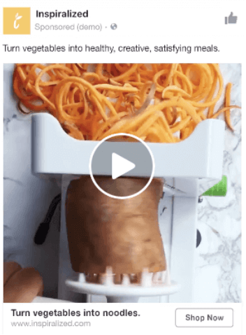
This ad is a great example of the old copywriting rule, “show, don’t tell”.
There’s something strangely alluring about watching a piece of sweet potato being shredded into hundreds of twirling noodles.
This video conveys more in a few seconds than any ad text could hope to do in hundreds of words.
Sometimes less really is more.
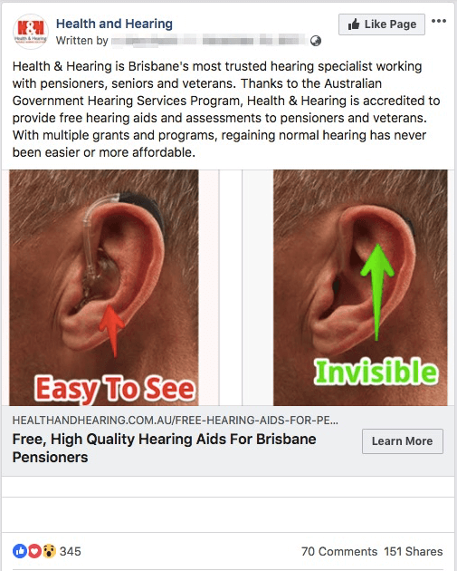
26. Health & Hearing
Health & Hearing is a Brisbane-based hearing aid clinic.
This ad is designed to generate bottom of funnel enquiries by leading with a “Free Hearing Aids” offer.
The imagery shows the benefits of an invisible hearing aid — it looks like the wearer isn’t wearing a hearing aid at all. Red and green “traffic light” colours have been used to convey “bad” and “good”.
Notice how they use references their involvement in the “Australian Government Hearing Services Program” to build trust and convey expertise.
This ad has 345 likes/loves/surprises, 70 comments, and 151 organic shares, all of which contribute to the authority of the ad’s message.
27. Geico
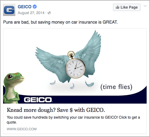
Geico are a car insurance company, but their brand positioning is typically humorous and fun – this ad is no different.
The image in this case is a bit obscure, which makes it intriguing and draws in the eyes. Plus they’ve got the logo and mascot at the bottom of the image for congruency.
Something subtle but really intelligent in this example is the use of capital letters for “GREAT” and “GEICO”. Subconsciously the brain matches these two terms together.
28. GoFormz
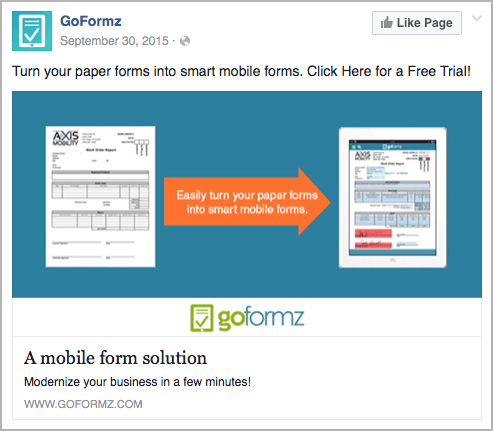
GoFormz helps businesses take their paper forms digital and modernise their business.
What I like about this Facebook ad is the use of the before and after imagery… It’s kind of like the age-old weight loss transformation photo but for forms. There is also some clear supporting text and it’s very obvious what the business has to offer.
One downfall is the text and heading below the image which doesn’t reiterate the messaging or encourage an action.
29. Kabbage
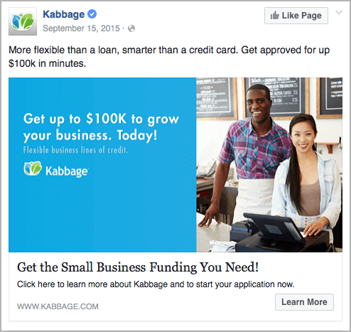
Kabbage offer quick and pain free small business lines of credit.
The genius of this ad is really the image again. They have some great brand congruency with the colours and logo, plus they’ve used real people who mimic the look and feel of their ideal customers. To top it off their messaging is succinct and to the point.
30. Digital Marketer
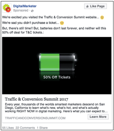
Digital Marketer’s annual “Traffic & Conversion Summit” is one of the biggest events on the marketing calendar.
Their retargeting campaign targets prospects who visited the event page but didn’t register.
Notice how they highlight the gap between the user’s behaviour (i.e. they visited the website) and the desired behaviour (i.e. purchasing a ticket).
The 50% offer and time scarcity make the proposition even more compelling.
31. Metromile
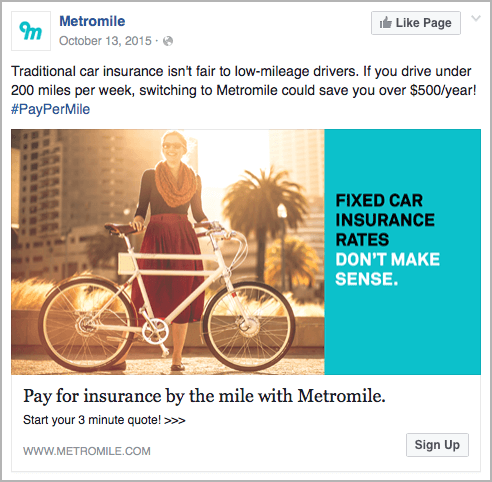
Metromile is a new form of car insurance that lets you pay for how much you drive, rather than on a set rate.
In the ad below they have used a recurring visual technique we’ve seen a few times now… The real-life image combined with a plain coloured background and short tagline.
The other thing they have done well in this Facebook ad is spell out their value proposition and point of difference by comparing themselves to every other insurance available. “Traditional car insurance isn’t fair… Fixed car insurance rates don’t make sense”. This positions them as unique and different, and shows prospects exactly what they have to offer.
32. Rinse
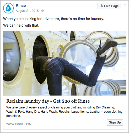
Rinse is a door-to-door laundry service for busy professionals.
The Facebook ad below combines humour with practicality by using a visual that reminds the prospect of what it’s like to do laundry all the time. The offer becomes more specific as you trace your eyes down the ad and finally read the specifics below the image.
33. Snapfish
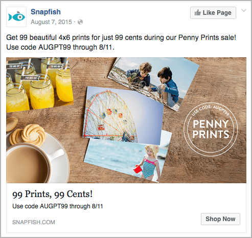
Snapfish does personal photo printing at a dirt cheap per-photo price.
This ad gets off to a great start by skipping straight to the important information… “Get 99 beautiful 4×6 prints for 99 cents”.
That’s crazy value and a really really specific offer that anyone would understand.
If that offer doesn’t convince you then the supporting image sweetens the deal by showing you what the prints could look like and reinforcing the deal with a “Penny Prints” embedded graphic.
34. Thrive Market
Thrive Market is all about buying organic health foods at wholesale prices.
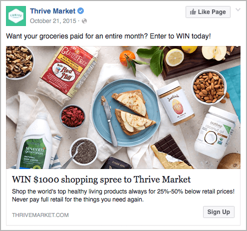
In this Facebook ad example, Thrive are running a contest to win an entire month of groceries. Running contests are a great way to build brand awareness and rapidly grow your contacts list.
Not only is the text in this example clear and specific, but the image provides a visual look into the type of food on offer at Thrive Market.
35. Optin Monster
OptIn Monster is a SaaS platform that lets teams capture leads from their website through a variety of popups and web forms.
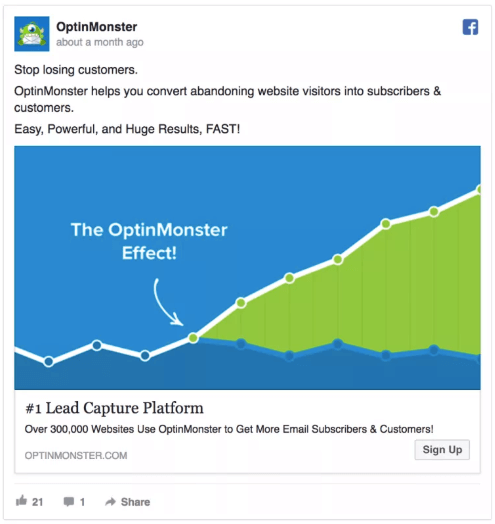
The ad uses great visuals. The contrast of the blue and green is likely to capture the prospect’s attention. And the before-and-after style chart conveys a lot of value.
The ad copy above the graphic does a good job of spelling out the prospect’s problem (i.e. “losing customers”) and transitions into a compelling value proposition (i.e. “convert abandoning visitors into customers”).
“300,000 websites use OptinMonster” is a huge credibility booster. Though it would be interesting to test this against a more specific number (e.g. 301,482 websites).
36. Verlocal
Verlocal connects people in local communities by promoting local events.
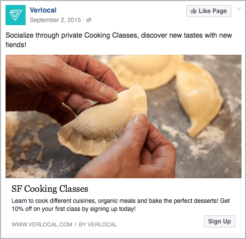
What’s great about this Facebook ad is that it gets very specific about one of the events Verlocal has to offer, rather than trying to promote the platform as a whole, which is less targeted. If you are interested in cooking classes, then you’ll likely click on this ad.
37. Your Free Quotes
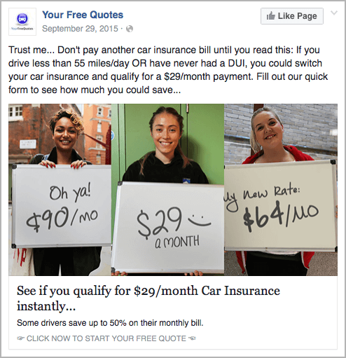
This Facebook ad from Your Free Quotes uses what looks like real-life images to put prospects in the shoes of someone who has saved money on car insurance.
The images they have used aren’t high-definition or professionally developed, but that is deliberate. They are shining a light on the customers they help, and if you happen to associate with these images you will be more inclined to take action.
38. Marketing Results
Naw, OK. We included one of our own ads for good measure 🙂
We’re a digital agency with specialist expertise in lead generation for complex services and major products.
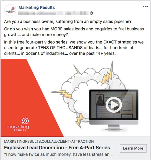
This ad is designed to generate opt-ins for our 4-Part Video Series.
The ad leads with a problem and calls out to a specific target audience (i.e. “Are you a business owner, suffering from an empty sales pipeline?”).
The second sentence “Or do you wish you had MORE sales leads and enquiries to fuel business growth… and make more money?” approaches from another angle, by explaining a desired outcome prospects may want.
It does a good job of using experience as a point of differentiation (i.e. “we show you the EXACT strategies we used to generate TENS OF THOUSANDS of leads… for hundreds of clients… in dozens of industries… over the past 14+ years”).
Notice how the rich, descriptive language. “Explosive Lead Generation” is coupled with a lightning cloud to illustrate the concept.
Conclusion
Facebook advertising is a growing trend for a reason… It has the potential to drive a big ROI for your business.
But it can be hard to grapple with if you’ve not done it before, or don’t have the budget to test things out.
The Facebook ad examples in this list are all from seasoned advertisers who have tested and seen results from their efforts.
They are a great starting point for you to shortcut your way to a successful campaign and design a high-converting ad of your own.
Still a bit unsure on what will work for you, or just want some help getting results with Facebook lead generation? Get in touch.
