
What’s the best way to optimise mobile landing pages like a boss in 2021?
Most marketers used to treat mobile traffic as an afterthought… but those days are long gone.
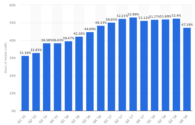
As much as 52% of global website traffic now comes from mobile devices, as this graph shows:
But here’s the thing:
Even though mobile traffic may account for more than half of your total visitors, optimising your website for mobile visitors rarely gets enough attention.
So if you’re looking for ways to convert mobile visitors into paying customers, you’ll love this post.
Free Template:
Best Practice Mobile Site Wireframes
Take the guesswork out of building high-performing mobile landing pages.
Swipe this framework to convert more mobile visitors into paying customers.
No Email Address Required
21 Mobile Landing Page Optimisation Best Practices (With Examples)
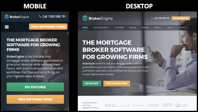
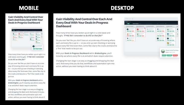
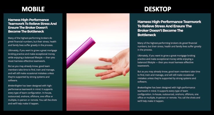
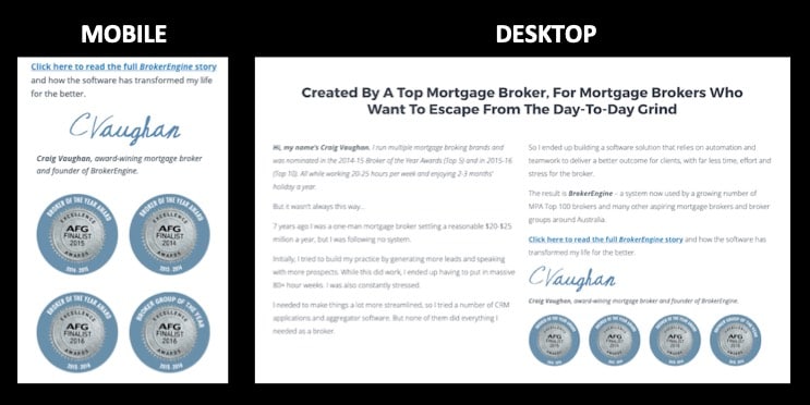
High-converting desktop sites don’t always translate into effective mobile sites.
Both share the same persuasion fundamentals, but the execution is different.
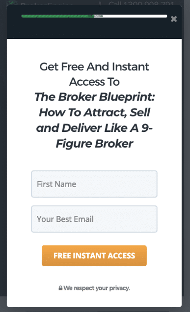
I have used examples from BrokerEngine, an automation software provider for Australian mortgage brokers.
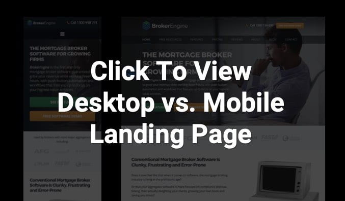
You can view their full mobile page side by side with their desktop page by clicking the above image (opens in a new window).
Maximise Real Estate In Your Top Banner

- Keep Your Logo Compact.
Most responsive themes default to a full-width logo on mobile devices. Reduce the size of your logo to maximise valuable space above the fold. - Include A Click-To-Call Phone Number.
Click-to-call lets you fast-track buying conversations. (According to Google, 49% of consumers said it was important to be able to call a business when making a purchase.)
Simplify Navigation With A Mobile Menu
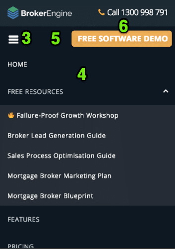
- Use A Sandwich Icon.
The sandwich icon (☰) converts multi-level menus into a thumb-friendly format. This makes it easy for users to find the information they need. - Use Simple and Clear Menu Labels.
It should be clear what users can expect on each page before they click. Structure pages into logical hierarchies so users can find what they need fast. - Test A Persistent Header.
This makes it easy for visitors to navigate to key pages without having to scroll all the way back to the top of a page. - Add A “Sticky” Call To Action.
Persistent call-to-action buttons allow users to act immediately without scrolling.
Optimise Above-The-Fold

- Redesign Your Splash For Mobile.
Key elements (e.g. headline, value proposition and call to action) should be above the fold on mobile devices.
- Place Your Value Proposition Above The Fold
Every business needs a compelling value proposition. Tell visitors what makes you different and why they should choose you. Focus on ‘point of difference’ benefits that your competitors can’t claim. - Use Thumb-friendly Buttons.
Use over-sized, high-contrast buttons that users can tap without zooming. - Use Mobile-Friendly Popup Forms.
Use button-triggered popups to eliminate distractions and maximise conversion rates.
Here’s where you can find more above the fold website optimisation examples.
Free Template:
Best Practice Mobile Site Wireframes
Take the guesswork out of building high-performing mobile landing pages.
Swipe this framework to convert more mobile visitors into paying customers.
Be Deliberate About Content & Layout
- Lay Out Headlines, Images and Text For Mobile.
Most mobile landing pages use a single-column layout. If you use dual columns or a sidebar, you’ll need to consider the most appropriate order to show each element.
- Truncate Or Remove Select Elements.
Review what information is shown on your mobile landing page. Remove irrelevant information and consider letting users hide/reveal extended sections of text.
- Rearrange Layout To Fit.
Improve the user experience by restyling or repositioning elements for mobile viewing.
- Add A Final Call To Action. Scrolling can be tedious on a mobile device. Add a relevant call to action at the end of each page so users don’t need to search for next steps.

Make It Easy To Take Action
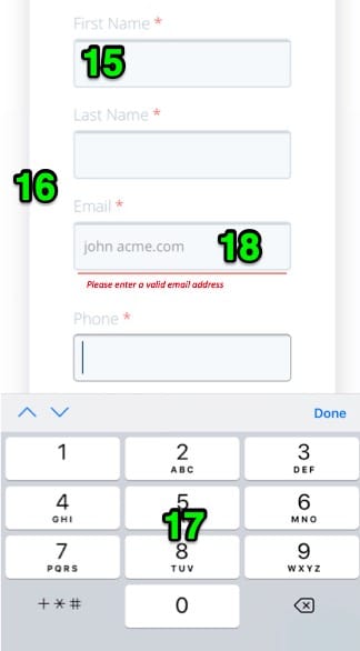
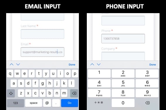
- Specify the best Mobile Input Type.
Mobile keyboards are one of many ways to input information. Consider the easiest way to capture prospect details. This might include alphanumeric keyboard, number pad, sliders, buttons, etc..
- Use Oversized Input Fields.
Reduce the need to pinch and zoom. Use oversized, full-width input fields. - Only Collect The Information You Need.
More fields usually translate into lower conversion rates. Only collect information relevant to the offer. For example, don’t collect phone numbers if the user is requesting an online resource. - Use Real-time Validation Rules.
Don’t wait until a user submits a form to tell them their response is invalid. Use validation rules to verify the formats of phone numbers, emails and other inputs in real time.
Think “Mobile First”
- Optimise For Speed…
- Lighter Images.
Compress all images and use appropriate file types to reduce load time and increase page speed. (Recommended tools include TinyPNG or Smush.) - Optimise For Speed (Lazy Loading).
Use “Lazy Loading” plugins to load sections of the page as users scroll. This means smaller increments of the page load at any given time, increasing page speed.
- Lighter Images.
- Track Mobile Traffic Separately.
Create separate Google Analytics Views for mobile and desktop/tablet traffic. Often the usage behaviour is so different that it warrants analysing them separately. - Mobile-Specific Optimisation.
Desktop and mobile users behave very differently. When you combine desktop and mobile tests, the upside of one channel may cancel out the other. Mobile-specific split provide clarity and certainty around conversion-rate changes.
What To Do Next
Implementing these 21 best practices for improving the conversion rate of your mobile landing pages is the surest way to win more business from mobile visitors.
- If you want more ideas and a proven framework to strategise, plan or execute client-getting campaigns, download a free copy of the Marketing Results Strategy Map.
- If you’d like personal help to uncover and prioritise the growth opportunities in your business, request a Free Growth Session with a Senior Digital Strategist.